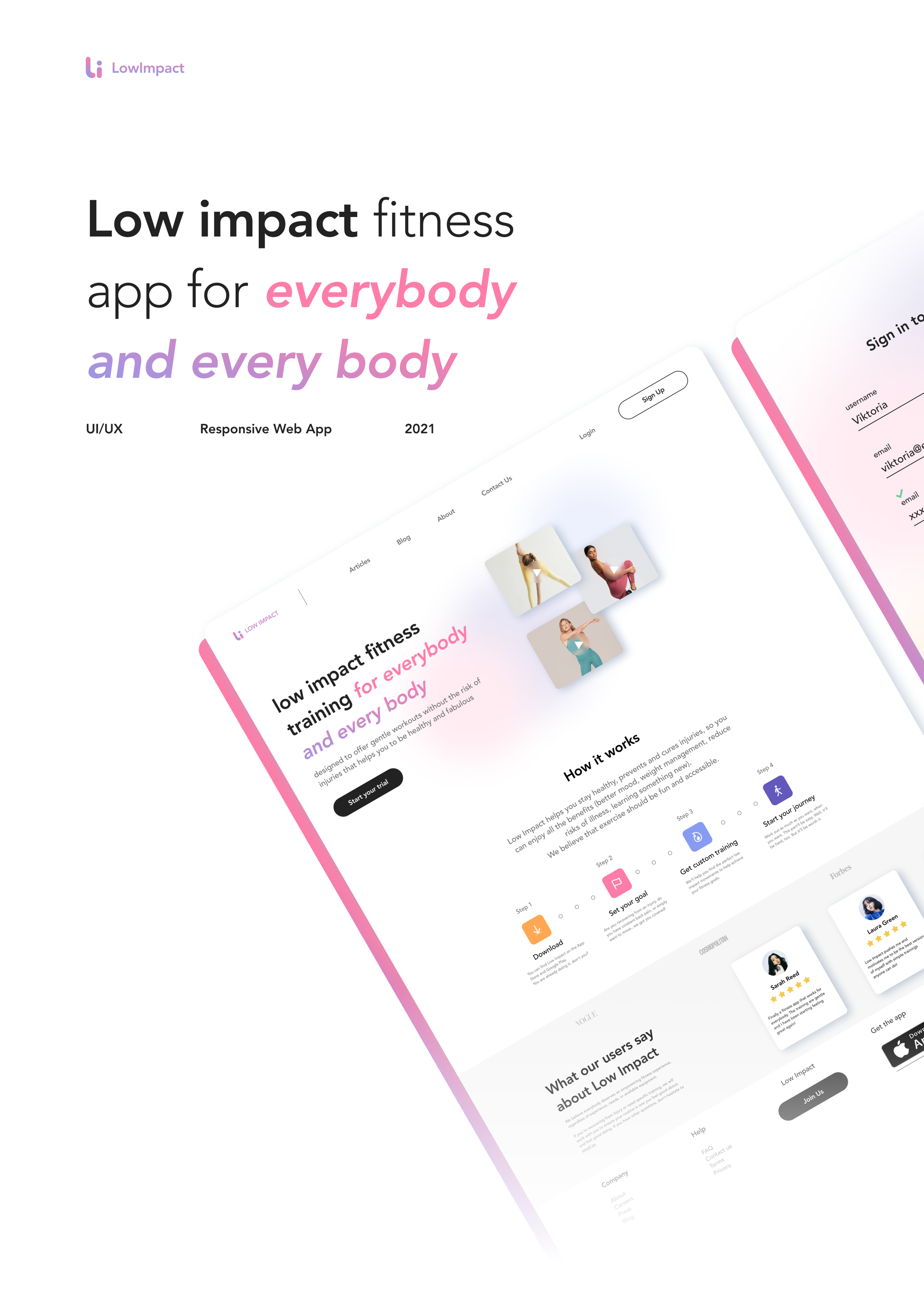
My project has been featured by CareerFoundry to give prospective students an idea of the quality of work that comes out of a CareerFoundry specialization course.
Project overview
Why a Fitness Project?
Behind this decision, there is a personal interest in fitness and training apps. Some of my family members have mobility issues and injuries themselves and don't have access to current fitness apps. Alongside some of the exercises could be rather harming. With this project I want to create awareness that not everyone is seeking the perfect body but simple a healthy body.
The market of fitness app is flourishing with the offer, but there is a gap alongside the potential: What happens when the high tech generation becomes older and will still be triggered by the idea of cultivating a fit body that stays young but with less mobility and with the risk of injuries?
During my recent travels, I noticed meet-ups at the beach or in parks of seniors working on easy movements to improve their mobility. The social aspect associated with the physical one reminds me of the Latin quote: “Mens sana in corpore sano”. One day, with a bit of luck, we will all be happy seniors!
My role
UX UI Designer
Tools
Figma
User flow
Photoshop
Style Guide
Objective
Help users to prevent injuries, stay fit and healthy with exercises based on low-impact exercises that suit their body shape and condition.
Context
In a few years, our savvy tech generation used to a sedentary life, and the unmoderated use of pc and mobile will experience physical problems that are unknown to others. Many will want to stay young, active, and fit and don’t like the idea of ageing.
This generation who is used to staying fit will have the trigger to stay healthy and in shape, but due to age will not be able to use the same tools as in the past.
This responsive web app will help people stay healthy and in shape while preventing severe injuries while focusing on mobility problems focusing on low-impact excercise.
Who am I designing for?
I created personas and user flows to guide design decisions, priorities, and develop empathy with potential users. Their needs and goals help me reminding whom I am designing for to make informed decisions during the whole process.
Designing process
I started sketching my ideas, focusing on the most important features. When I was satisfied with the navigation, I moved on to wireframing on Figma, where I designed a clickable prototype. I decided to follow the iOS Human Interface Guidelines, a grid system, and a mobile-first approach.
Mid-Fidelity Wireframes
UI Elements
To ensure design consistency, I applied a grid and put together a style guide focused on the UI. The result is a curated library of colors and components with an accessible color palette and a visual language system.
Styleguide
Color palette
Text & Background
Background to be white, unless there is an image. Use shades of gray tones for non-active icons, non-active CTAs, text, and background support for elements (such as search bar, progress bar, and similar). Text to be #717171 or #222222.
Typography
Vibrant and strong colors to express energy and joyfulness. The colors will be used for the charts and graphic elements. Active buttons and active icons to be #FD7DA8.
Primary & Secondary colors
Icons are lightweight and minimalistic. The accent color
is applied to indicate when the icon is active.
Iconography & Logo
The Low Impact logo must be minimalistic and have a gradient using ##879BF2, #FD7DA8. The logo will appear on the first screen of the onboarding on the top of the screen.
The appropriate imagery for Low Impact follows a minimalistic style, with a simple background in warm colors. The images show a variety of body sizes, skin colors, as well as young and less young people to be inclusive. The message that Low Impact communicates through these images is that fitness and exercise are part of a healthy lifestyle and that there is no aim to reach a perfect body.
Chips & Buttons
Charts & Graphs, Tab button & Illustrations
Imagery & Charts

Get started
The Onboarding screens help the users to learn the features of the app with fun and evocative imagery. The Tailoring screens will make the experience on the app designed to the needs of the users like if they had their personal trainer in their hands.
On Low Impact users can track their activity on the Profile screen. The stats inform them when they have been training, which class or exercise they did, and their activity time. They can also collect badges in the achievements section.
Move your body
Users stay informed on new trends about health and fitness and can check what the community around them is up to!
The Search screen lets users browse what they need. The training is divided into basic movements (to learn the basic and some tips to prevent injuries), exercise (the low impact movements the app is all about), and SOS relief (specific mobility movements designed to relieve pain).
Track progress
Retrospective
The minimal viable product is ready. What now?
After 3 months of design and development, I finally created the minimal viable product for my Career Foundry final exam.
What comes next, is the chance to get insight, learning and iterate over our product. I plan to set user interviews and user testing campaigns to analyze how potential users interact with the app.
Expected outcome
We’re humans, and part of the products are based on assumptions, some of them created based on the research, competence analysis, and others, based on the personas and the user we want to reach.
When we test the product it’s time to validate (or not) all these assumptions.
Are the assumptions correct.
Are following the right direction?
And back to iteration and more testing!
Responsive WebApp
For the responsive design I used the fluid grids which gives the possibility to adapt the layout at different breakpoints.


