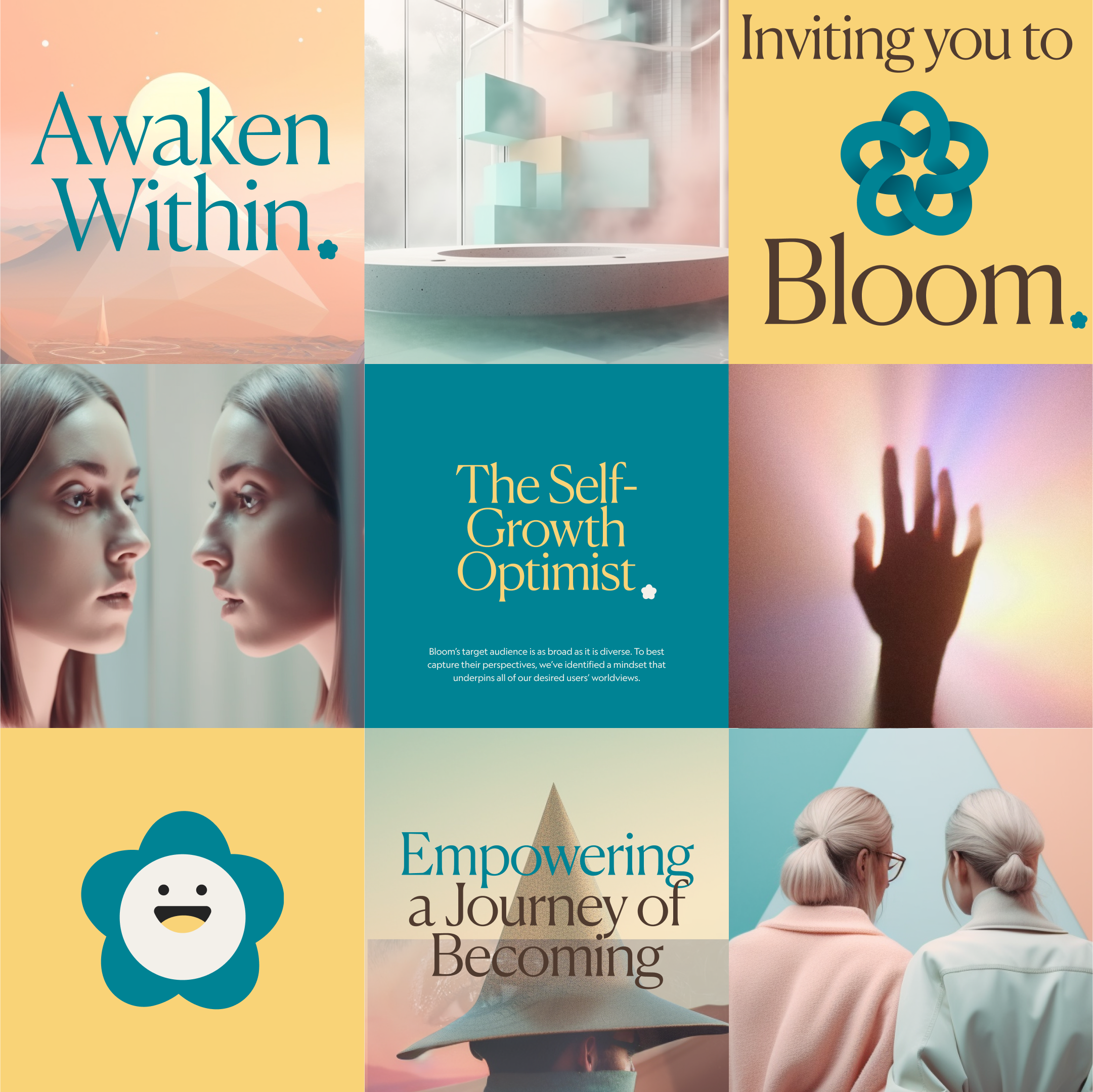
Bloom is a self-empowerment company on a mission to empower everyone, everywhere to actualize their potential. Bloom envisions a world where anyone can affect positive change for themselves and their communities.
The challenge
The challenge of a rebranding for a mental health app with the requirements of being modern, built on science, and designed for engagement means that the app must meet the needs and expectations of potential users. The rebranding should communicate that this app can provide a modern, effective, and engaging experience. This could be done using updated visuals, messaging, and features that demonstrate the app’s commitment to utilizing the most recent advancements in mental health therapy and techniques. Further, the branding should emphasize the app’s scientific foundations and desirable user experience to encourage users to feel comfortable and confident in using the app.
01
Brand Strategy


02
Visual Identity
AI-Generated Photography
Use of Midjourney
Midjourney's AI capabilities give us the ability to deliver images that adapt to the client's needs while keeping the overall look and feel consistent. The challenge with Midjourney is to find a prompt that provides a unified aesthetic and an infinite scalable design, while preserving the messaging Bloom wants its users to experience.
The message
At Bloom Photography, we pride ourselves on fostering a safe and welcoming environment for people of all identities. Our photography has a futurist and geometric look, with neutral tones, that conveys a world populated by humans that is secure and advanced.
What I learned: The Midjourney prompt formula
A simple and short Midjourney prompt typically results in images that are taken directly from the Midjourney training data, while a prompt with more details, styles, and parameters, customize the default behavior of Midjourney, and create entirely new and unique images.
PROMPT: subject, detail, style, color palette, --ar 3:2 --v 5









Color Palette
Primary Colors
Our primary palette is our foundation. As the first touch point across all of our communication and messaging, its consistent usage cements a distinguishable visual cue for the Bloom brand.
Secondary Colors
The neutral pastel tones colors in our secondary palette gives us more creative freedom. These are specific to typography, illustrations, and color backgrounds. Used on their own or together, these colors can complement or add visual interest to images and messaging.
Neutral Colors
Neutrals add balance and warmth to the cooler tones in our primary palette. These colors should be used thoughtfully to break up dense content or build a visual hierarchy.
Utility Colors
These colors indicate errors or successes in the product.
Text and background color combinations is chosen to provide enough contrast to be legible to a wide audience and to pass the WCAG AA compliance.
03
The final product
Social Media
Bloom is a self-empowerment technology company designed by leading therapists. With more than 2 million downloads, Bloom, the mental health app, makes therapy and self-growth more accessible through interactive videos and the latest AI technology with personalized content and insights.
Headquartered in New York, Bloom was founded in 2019 by entrepreneurs Daniel Lohse and Leon Mueller


